Pansoft is an information technology and services company focused on providing marketing analytics services for the healthcare industry. Pansoft approached me to redesign the company's brand image and create assets that provide a stronger identity to prospective clients
My main goal for this logo redesign was to incorporate elements that conveyed the company's business - mainly healthcare analytics. I saw the opportunity to turn the bowl of the 'p' letterform into a donut chart. I sketched a few iterations to test readability and decided to go with an exploding donut. I chose a palette consisting of blues and greens to link with the company's healthcare ties.
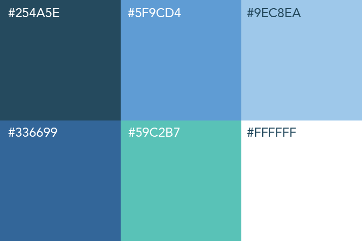

After review, the solid fill made the logo feel quite heavy, and at smaller sizes becomes difficult to discern between segments. I modified the image to just be colored strokes rather than fill so that I could easily adjust the weight as needed. I also tweaked the letterform changing the intersection of the bowl and stem to a green '+', a symbol prevalent within the healthcare field.
The final logo contains elements that clearly reference healthcare and analytics, while also resembling the 'p' letterform.


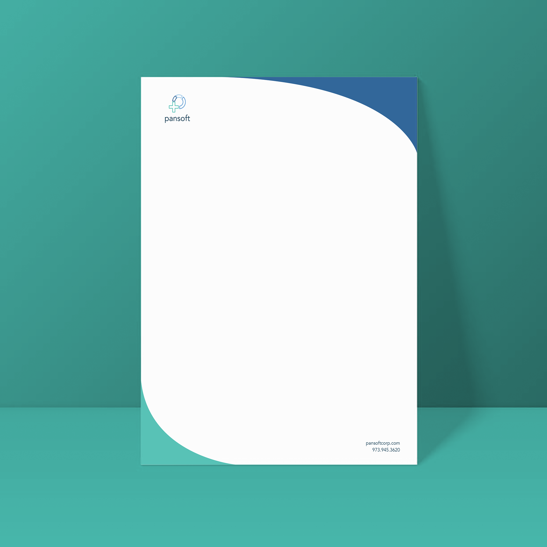
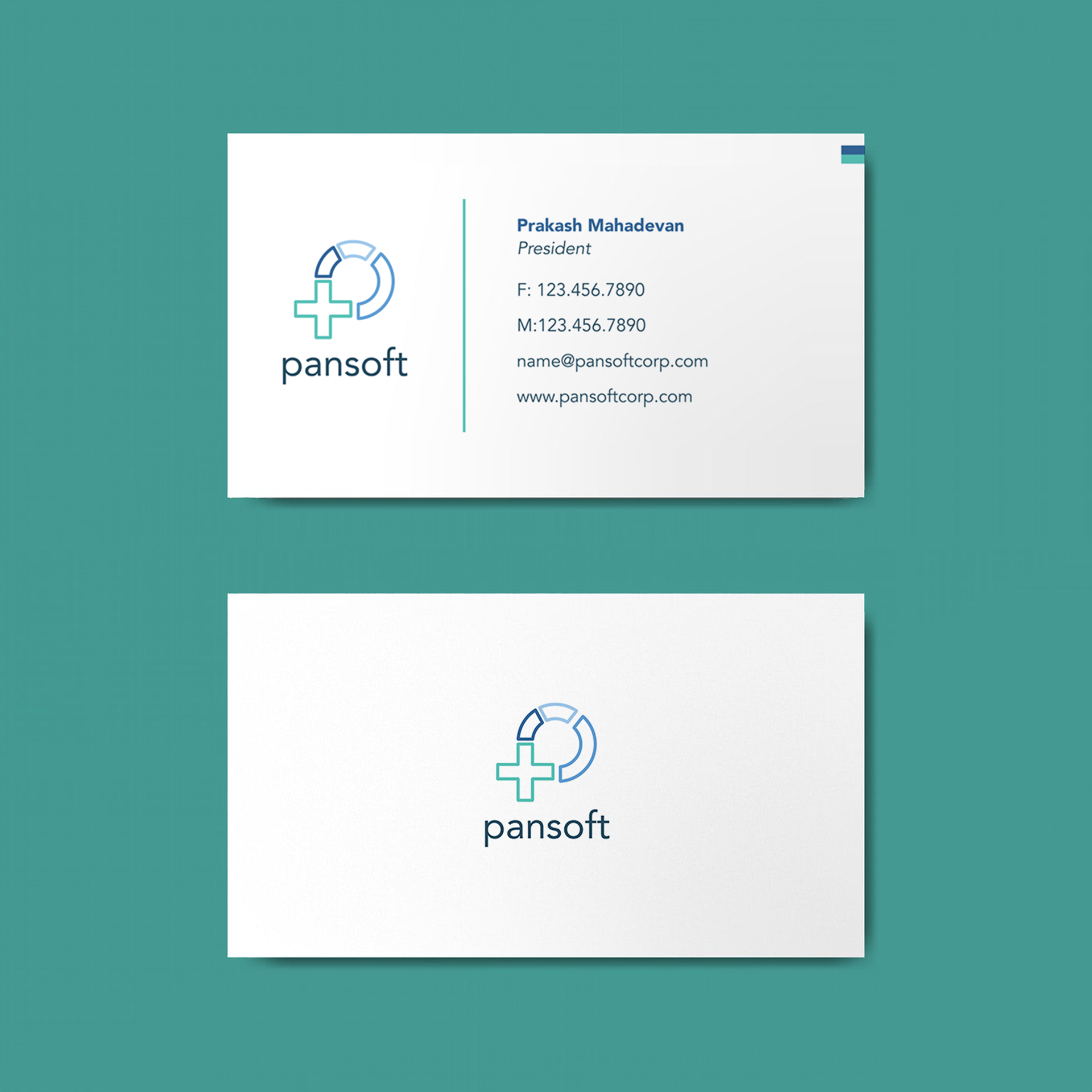
In addition to the logo, Pansoft also requested of a few branded assets, namely a letterhead and business card design.